Typography in design isn’t thought of as a design element. You think of illustrated graphics, images and video. But the type font isn’t often considered with those. Typography in design isn’t thought of as a design element. Here’s how to think more about typography in your design and how you can use it.
90% of Internet is written word
With so much of the online information in type font it’s worth exploring beyond Open Sans or Oswald. Not that those two are a bad combo. But checkout Typekit. It’s a paid service. But if you want to go beyond Google fonts it’s worth it.
Don’t do blinking text
This reminds me of the days when car dealers would call me and ask for an (espanol) starburst that flashes. Blinking and flashing is more annoying that something that catches the eye to draw attention for conversion.
It seems like a great idea but it cheapens the design which in turn cheapens the appearance of a business website it’s on. Another reason to avoid this is people who are seizure prone can’t view it and can cause them to have a seizure. Worst case scenario is your site causes someone to have one of these and a letter from a lawyer arrives.
Avoid green and red text
Most text this color is for warning and calls to action. So to not lose your calls to actions don’t use these colors for your body copy or headings. Consideration about this has to do with users that could be color blind (about 8% of men). Not all see green as green. So it’s more about color cues to grab attention than anything else.
“Typography exists to honor content” – Robert Bringhurst
Watch spacing and line height
It’s not always a good idea to just use something because you like it. Test it out with a large audience. I remember when Facebook tested a new font type and size for the mobile news feed. I’m glad they didn’t. Even though it looked close to Arial it was difficult to read. It made most people get headaches because of eye strain, me included.
Careful about which type font you use all caps on
NO ONE LIKES SCREAMING.
But it’s not easy to read all CAPS inline with a paragraph. So consider whether the font should be in all caps or not. As a choice for design all caps works on bold and black font weights. But not on all fonts. Again choose wisely your font type before using it in all CAPS. All caps are fine when it really does not require reading. That means this doesn’t necessarily include logos, titles or headings.
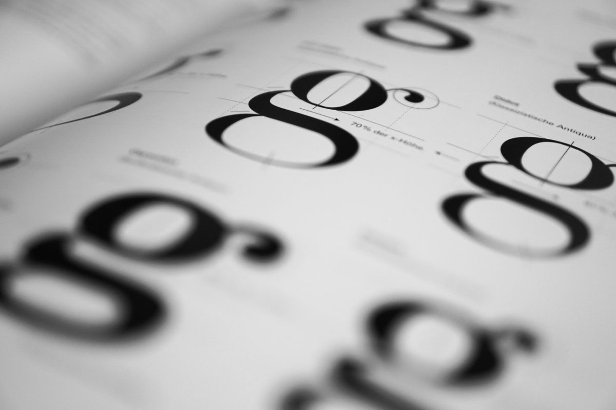
Use distinguishable letters
Avoid decorative fonts you can’t read. Decorative fonts can class up a website. But it could completely render it useless to read. Test the decorative font in all possible sizes. Especially on mobile devices. A good way to check is head to Google Fonts and look at the “i”s and “L”s of words that you would use. Does the “r”s look like an “n”? Or more like a “m”? Google will let you try out your copy on their Fonts website before you do on yours.
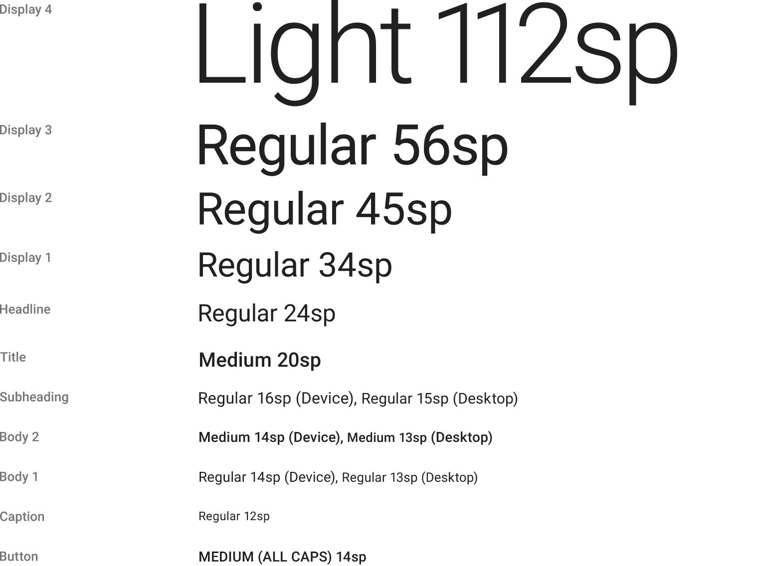 Check in various sizes how it looks
As with decorative fonts check your font choices on mobile devices and in all sizes and font weights. Remember that your desktop screen isn’t a mobile phone. If it isn’t legible on a screen that’s 320 pixels wide vs a desktop that is physically larger, then don’t use it. Use a font that is easy to read first on the small screens. Mobile devices should use about 30-40 characters per line to also aid in readability.
Keep the number of fonts used at a minimum
The one thing that screams amateur is seeing a design with more than two or three font types. It makes the piece or website hard to read and can confuse the user on what is important. Remember if you can’t decide what is important your users won’t care either.
I hope this post was useful, and if you would like a consultation on your brands choice of typography, let us know in the comments below.