Bourbon is booming, and advertising agencies are loving it. Lots of launch parties, tastings, tours, and speakeasy meetings. It’s a great time to showcase new label designs, web and print ads, and creative POP materials. Graphic designers LOVE bourbon, and I’m not talking about the taste. Liquor ads and collaterals are arguably one of the sexiest marketing venues around to showcase a graphic designer, or photographers, creative talents. It’s our time to shine.
Unfortunately, even great concepts and campaigns can be lackluster if your liquor photography is flat and lifeless. There’s no magic recipe for creating eye-catching liquor photos, but there are a few tricks of the trade to help you get the most out of a bottle of pure grain nectar.
Tip #1: Liquor Loves Light!
Many bourbons today are bottled in wonderfully shaped, trademarked bottles. Play around with your lighting and see how the light refracts through the bottle, making the beautifully rich liquid dance without moving.
Tip#2: Combine Multiple Shots for Wow Factor.
Using the magic of Photoshop layers, you can combine several exposures into a single kick butt image. Shoot one for the bottle, one for the shadows, one for the highlights, one for the tech, one for the label and heck, while you’re at it a couple more with some wacky lights, just in case. Then in Photoshop, stack the layers and pick the best bits from them all.
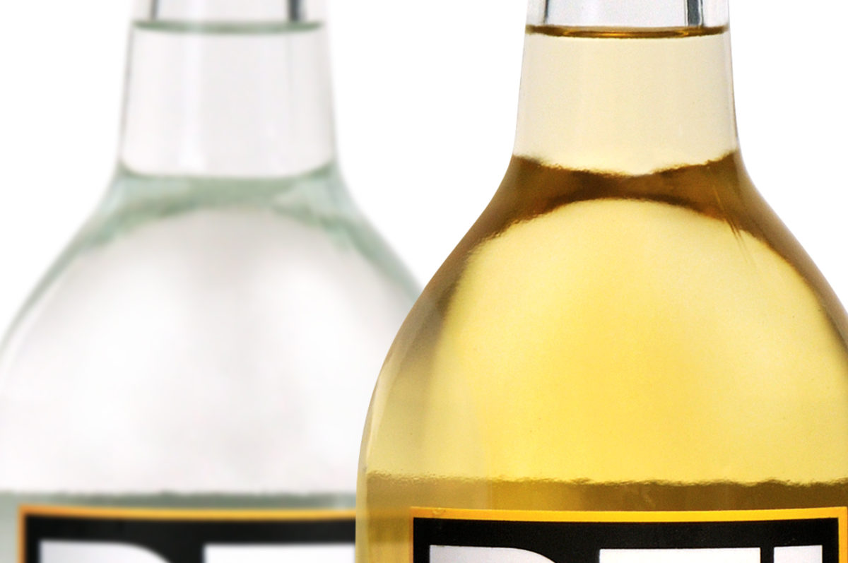
Tip#3: Watch The Curves
There is a fine line to walk when shooting the rounded neck and shoulder on a liquor bottle, especially when it’s a clear distillation like gin or vodka. There needs to be an obvious differentiation between the glass and the background, even though the material is saying “We’re clear!” A couple of tall, dark reflector cards placed on either side of the bottle will give you the edge you need. Again, shoot a variety of exposures, moving the cards in and out to vary the line thickness.
Tip#4: Make Mine Straight Up
Take time when you set up your initial crop. Make certain the labels are dead center aligned, not set up in some sloppy, almost good enough set. Camera height and lens choice are critical, too. Shoot with a 50mm lens minimum, (preferably 85mm to 105mm), to give the bottle a natural “as seen with the eye” look. Wide angles are for great for effect, but typically lousy for product photography.
Tip#5: Never Drink (or eat) Anything at a Photo Shoot
Photographers do whatever it takes to get the right shot. That open bottle of “Uncle Bob Thompson” might be 8 year old, aged to perfection bourbon, or 8-month-old, flat and stale Pepsi, mixed with who knows what. Liquor in real life doesn’t always look the way the client thinks it should so photographers may need to “enhance” its charm and richness to make it speak to the customer. Today, Photoshop is the best and quickest method for color adjustment, but you never know what’s in that open bottle.
Tip#6: Don’t Rush Perfection
It may have taken years to get that nectar of the gods ready for human consumption, so give it the justice it deserves. Take your time with the shot framing, the lighting, the focus and the retouching. Take pride in making an image as close to that “sweet spot” as possible. Once it’s on the web or in print, you don’t want to have that “I wish I would have done a better job on that” feeling. Liquor photography is a time to let your photo and retouching talents shine.
To paraphrase Mark Twain:
“Too much of anything is bad, but too much good whiskey (photography) is barely enough.”