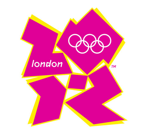
$625,000.00. Yes, you read that right. $625,000.00. was paid for this atrocious logo created by a London, England firm for the 2012 Olympic games. I doubt that most clients in search of a new logo would pay that much, but it is surprising what they will settle for as the cornerstone of their identity. As in most things, you get what you pay for, and, as in the case of cheap logos, sometime you get even less.
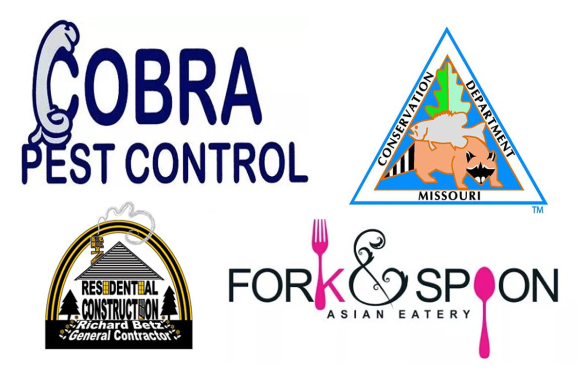
We recently had a client who came to us for a complete branding and marketing strategy. They had tried the seemingly cheap route of “I know a logo guy,” and had paid a couple of hundred dollars for total disappointment. They showed me the logo, (which wasn’t really a logo), and I immediately recognized it as a freebie clip art illustration. There was nothing unique about it at all. It was a 20-second web search, click here to download, here’s my invoice type of effort. Weak!
If you really care about your brand, you need to show it a little love. Bargain basement logo websites, that devalue designer’s talents on a global scale, are not your best bet. The nifty website that can “create a logo for you” (from a template) does not have your best interest in mind. Even legit design studios sometime try to force an identity on you that is not who you are.
Tip#1: Make sure they listen.
Initially, only you know your brand’s story. Take some time to explain to your agency what your brand is all about and what the new logo should express. Personal preferences, like colors, fonts, and intended usage are all key starting points of logo creation. The more information you can share about the brand the better.
Tip#2: Make sure you listen.
An experienced designer can guide you through the pitfalls of creating a bad logo. Many clients have an “everything PLUS the kitchen sink” approach to what the want. Simplicity is key in a logo. Learn what you need, and don’t need the logo to do.
Tip#3: Ask for options.
In an ideal scenario, you explain what you want, it is designed, you love it, and everything is good to go. In most cases it will never happen that way. You need options, several options, to work out which avenue to take with your logo. Three to five is a good starting point. That will give you, and the designer, a good base to build upon.
Tip#4: Color is a BIG deal.
Color schemes play a huge role in a logo. They can say “I’m Bold,” “I’m Mellow,” or “I’m Elegant.” Think about how the logo will appear in print, on the web, and reduced to a very small size.
Tip#5: Feel confident in your choice.
It’s great to like your stuff. You should be happy, and downright proud of your new logo. You didn’t settle. You got what you paid for, and it expresses your brand in a positive way. It’s not a cookie cutter logo, and it shows. NOW you’re ready to build your brand.