You may have heard the term geofencing mobile advertising used with serving ads in apps on smartphones and other devices. That technology uses geographic location to find users within a proximity of a business and send ads to that business’s branded app. When we talk about geofencing, our goals are much bigger. Here’s how geofence mobile advertising works.
When we talk geofencing, our sights are much bigger.
At Element 502, when we say geofencing we mean finding all mobile devices in a given geographic area and serving mobile advertisements via app banners and mobile website ad space. Those devices do not need to have a specific app installed to work with our program. Additionally, our geographic region does not need to be right around your business. In can literally be anywhere.
Three Legs of the Geofencing Mobile Advertising Stool
There are three main components to a successful geofencing campaign:
- Clearly identifying where the fence is placed
- Engaging digital advertising and calls to action
- Landing page and offer presentation
Let’s take a look at each of them.
Building a Fence
To begin, we start a geofencing campaign by identifying where your target customers are going to be gathering. This could be a convention, trade show, your store, a concert or someplace else. We work with you to find that location. We create the fence once the location is decided on.
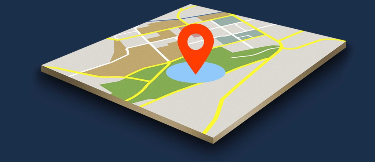
For clarity, a geofence is a virtual circle we draw on a map that represents the area that we will use to capture mobile devices. We use our tools to find the latitude and longitude of the center of our fence as well as define the radius. Our platform allows for a radius as small as 100m. This means exact targeting with less unwanted traffic. After the fence and audience are identified, the fun begins. Next, we design the creative.
Mobile Advertising Design
Designing digital ads for mobile is quite different from print advertisements or other media. The dimensions of advertisements on mobile devices are quite small, so attention to detail is key. Contrast colors, strong calls to action and minimal copy are key to this platform. If the ad does not draw attention or present a clear message, users will scroll right past and not interact. To that end, understanding online advertising layout and creation are a critical component.
Going for the CTR
CTR is an acronym for click-through rate. By definition, CTR is the percentage that represents the number of times someone clicked on a digital advertisement versus the number of ads that were served. We want this number to be as high as possible. That said, the creative is only the beginning. Our next challenge is the offer or “hook”. Think of it as the lure you use when you are fishing. You can be in the right spot, but is the lure attractive to the fish you want? Same idea applies to your prospects. You need to put an offer that entices them to find out more. You often hear this referred to as the call to action on the advertisement. This may be done with clever creative, a discount or an exclusive offer. To be sure, we can work with you to identify what really speaks to your audience.
Where Do We Go from Here?
Once someone clicks on your ad, where do you take them? If you simply point them to your website’s homepage, is there a clear next step? If the goal is only branding and awareness, this may be a good strategy. However, we often want to gather more information about the prospect. A landing page is the page on your website that a user comes to after clicking the ad. This page usually has a form that we use to help identify the customer. To do that, we need to ask them to give us a name, email, phone number, or other useful piece of information. All data, outside behavior, needs to be given by the user. If we ask for that info, what do you offer in return? Make sure it matches the “hook” from the advertisement. Still, a question needs to be raised about responsive design?
Responsive design is the method in which a webpage is constructed so that it looks good on any device. In our case, we are concerned about the phone screen. No one likes to “pinch and zoom” to navigate a website. You may have been a victim of this design. You land on a site and either the text is so small you cannot read it, or information runs off the side of the screen so that you have to scroll back and forth to read it. Good design eliminates that issue. In addition, it clearly presents the value, next step and additional information.
More than 10x the national CTR average
When implemented correctly we see some fantastic results. With our geofencing campaigns we see CTRs that can top 1%. With traditional display ads, the national CTR average is around .09%. When you do the math, that equates to about 90 people responding for every 100,000 ads that are served. That means on a geofencing campaign those same 100,000 ads can generate 1,000 people. You can see, that’s more than 10x the national average.
It’s simple, our customers love using geofencing. To continue our series, the next blog post will look at our three titans of advertising and how they function in the context of going to, or virtually attending, a trade show.
If you found this article helpful, leave a comment and let’s discuss how you’re using mobile ads and if geofencing is a fit for your businesses mobile advertising needs.
See how Geofencing ads helped Pieology get more foot traffic on their grand opening


Marvelous, what a webpage it is! This website provides
valuable facts to us, keep it up.