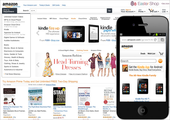
Making a website usable by site visitors is something that is becoming more important than in the past. As mobile screens increased on the market developers needed to create sites that would work across any screen size seamlessly. But what is “Website Usability” and how do you test for it to see if yours is either pass or fail?
Web usability is the ease of use of a website. Some broad goals of usability are the presentation of information and choices in a clear and concise way, a lack of ambiguity and the placement of important items in appropriate areas.
Sounds a lot like good UX Design and practices. But there is a bit more.
Print vs Web Design
Turning pages in a brochure is not something that requires a skill or documentation to follow. However clicking links on a website can take nearly any form (depending on the whims of the designer). With Print Design there is unlimited pixel control depending on the printer. But in web high resolution images are art can cause pages to load slowly and lead to a drop in users on the site.
With regard to looks, there are many websites that are just plain ugly. But highly functional and users are able to navigate through with little thought and effort. In eCommerce the stakes are high because eCommerce websites that are not usable go out of business in a matter of weeks.
For these reasons, usability should not be an afterthought in website design.
Accessibility

If you hate waiting in a checkout line at the store to either purchase or return an item, imagine that same frustration for your site users. Server uptime is important so your visitors don’t get a blank page or a long wait time. Invest in good hosting is the simple answer. If you aren’t sure contact us for a consultation.
Broken links sends a visitor back to Google search results faster than a 404 page. So if you have no idea about how many are broken we recommend Broken Link Checker – http://www.brokenlinkcheck.com/
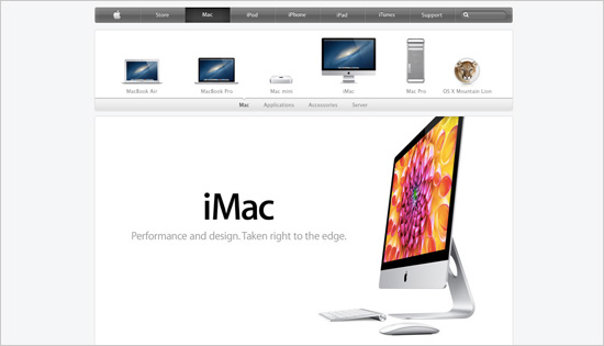
Mobile responsiveness has been around since 2010. So if you are a site owner and it’s not responsive don’t expect your site to be index in Mobile Search Results on the search engines. Also, it’s not just phones that your website should be responsive to. All devices with screen sizes 1200 pixels wide or less should be considered. Even Apple has referred to some of their laptops as “devices” not laptops.
Clarity

If content is king, then clarity is the queen. If you add elements (buttons, ads, and difficult copy to read) then don’t expect your site to be successful. Visitors have goals and if your website fails to help them meet that goal, then they move on.
You should have a website that is consistent in design. This keeps users minds at ease and familiar to you. If you have a site that has too many navigation items you’ll send them into decision shock and they’ll likely just return to the search engine to another site.
Credible
If you are not Coca Cola or Apple, you have to understand you are not credible yet. No one trusts you implicitly or sometimes at all. You have to earn this. Strong marketing and social campaigns can get that trust to help you attract new customers. But where are you sending them?
I once saw ads for a attractive offer (I’ll refrain from using names) and once I arrive to the site, it looked spammy. Without credibility it’s impossible to get traction and have visitors convert to loyal customers.
Offer a clear and concise “About Us” page with testimonials and some name brand logos of companies you’ve worked with and for. This goes a long way to sell your services or product as trustworthy.
Website Usability is never done
In developing websites that are meant to sell or promote you need a strategy that’s ongoing. It’s not a set it and forget it solution these days. Users change how they use sites, and search engines know this. 5 years ago talking to Siri or whatever AI was not something that people imagined would impact how they use device. Much less how we use websites when searching.
For the reasons of technology not slowing down you can’t either. Plan to update and improve constantly your web presence. It’s another cost, but the payoff is that you are making an investment to stay current and relevant. Two things you must do if you want to stay online and in business.
If you have any questions about website usability and to find out if your is, contact us to get a initial free consultation by leave a comment below or reaching out on our contact page by clicking “let’s talk” above.
See our case study on the web project for Liquid Integrity:


Having read this I believed it was extremely informative.
I appreciate you taking the time and effort to put this informative article together.
I once again find myself personally spending way too much time both reading and commenting.
But so what, it was still worthwhile!