Mobile Responsive design has been around since 2010, but marketers are still using it as a buzzword with prospects. But are designers thinking mobile first? Mobile devices are used more than any other source to access and search the web. If 60% of your traffic is from mobile devices, having a mobile-first WordPress theme should be your main focus.
Mobile-First Design
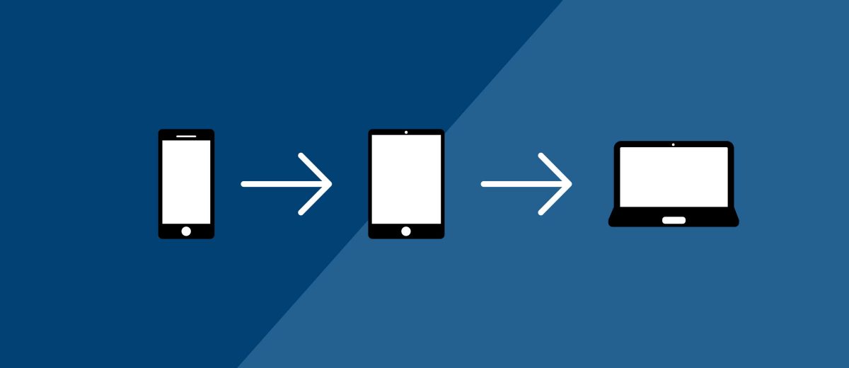
Mobile-first design starts with mobile layouts instead of beginning the process with the desktop. By concentrating on mobile first, developers, designers, and content strategists can focus on the minimal. This means better performance and optimization for SEO.
For the first time, more people around the world now use mobile devices to browse the web than desktop devices. According to data from a worldwide internet usage statistics report, mobile devices now holds 51.26% of market share while desktop devices have fallen down to 48.74%. Mobile is the future!
source: https://www.yahoo.com/tech/worldwide-usage-mobile-tablet-overtakes-desktop-first-time-171539743.html
With a mobile-first design, you have a smaller stylesheet (CSS) and fewer called declarations. Images are now smaller (because your phone screen size) and require fewer resources to load. A mobile device that loads a responsive website loads the same resources that a desktop loads. Unfortunately, this is a huge waste of the devices resources (memory) because your phone doesn’t use all the code that is required. It’s all about bandwidth.
Mobile-First Themes Are Better For SEO
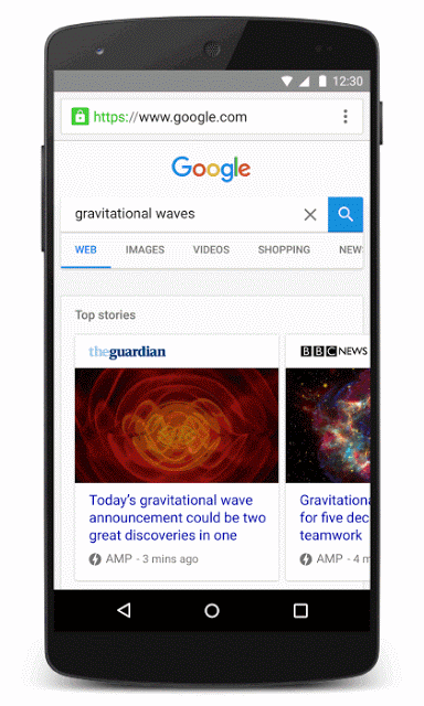
As of April 2015 Google’s Algorithm has favored sites that are mobile responsive first. WordPress has even partnered with Google to create the AMP project (Amplified Mobile Pages). When browsing the web on your phone, you’ll now see the option to tap open an article that is an AMP version of the webpage. Its load time is much faster because there are fewer resources required to load.
Facebook did this a while ago with Instant Articles. Though more interactive than the AMP pages, it’s a step toward a faster web as sites are now larger than they were 5 years ago.

Special Optimization For Mobile Is Almost Over
Google is now giving special treatment for mobile-first websites. In November 2016, the search giant started experiments to make its index mobile-first, hence the AMP pages.
Although our search index will continue to be a single index of websites and apps, our algorithms will eventually primarily use the mobile version of a site’s content to rank pages from that site, to understand structured data, and to show snippets from those pages in our results.
source: https://webmasters.googleblog.com/2016/11/mobile-first-indexing.html
With mobile-first WordPress themes taking a leading role in 2017, everyone will need to adapt. Designers must put more thought into designing themes mobile-first, rather than trying to fit everything into the desktop version of the theme. Element 502 developers and designers are proficient in mobile-first design. Contact us today for more information.