User experience is not just for the web, it’s also for things like print, remember the Steve Harvey incident, and email. In this post we wanted to share 5 UX email design tips.
1) Be useful
Figuring out who the email is aimed at is crucial. Consider sending flowers to someone who is not your significant other. It would not go over very well, and it would create a very awkward situation.
Taking consideration about who your audience is shows that not only are you professional, you also care about your customers. The worst thing to do is haphazardly firing out emails with no purpose, but no meaning to the persons receiving it.
2) Keep it simple
As it is with web pages, the layout of an email is critical in determining where your readers focus will be directed. Given the strict constraints of the email landscape, an even greater emphasis should be placed on how all the elements of your message fit together.
Crowding your content together may make you feel like readers will take it all in, but it won’t do anything but end up unsubscribed or sent to spam.
3) Have at least 1 Call To Action (CTA)
A call to action is a must in a email campaign. Without it the reader has no where to go should they arrive to a decision. Moreover, if you have more than one, then decision shock can occur and no decision is made.
Remember if I can’t tell what’s important to you how do you expect me to click the call to action you need me me to?
![]()
4) Encourage sharing
Remember before cell phones and internet? The way you wanted to spread the word about something was to create a phone tree. One person would call 2 people, then they would each cal 2 more people. A list of 10 people in your phone tree would exponentially increase the odds of reach.
That’s the power of social media.
We live a “social” world where everything is tweeted and posted for all their friends to see and share to their friends and co-workers. Why would you not take advantage of a pre-setup call chain. Remember to include the option for your readers to share your email to others.
5) Be Mobile Responsive
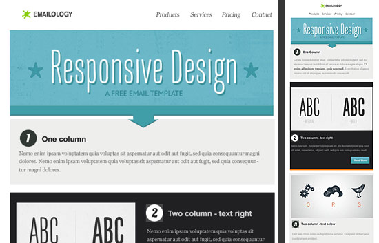
This goes without saying but some aren’t aware that emails can be made mobile responsive. This increases the open rate and click thru rate (CTR) for your emails.
With more and more people pulling out their phones to check their email, it makes sense to move toward this trend. If you’re using a Newsletter service like MailChimp, you’ve already got the tools you need. Most Marketing programs are equipped with mobile responsive templates.
What other ways we didn’t mention here that are must for good UX design in emails? We’ve love to hear what you come up with, so let us know in the comments below.


