Challenge
Renessence hair came to us needing help with their online store working. We took up the challenge and corrected development issues on their old theme. Afterwards it became apparent that a new WordPress theme was required in order to sustain their online growth.

Renessence Hair Design
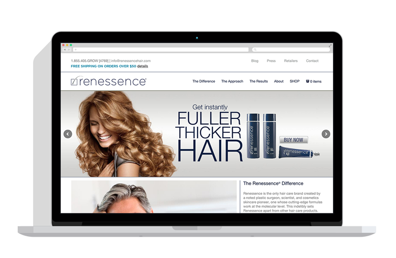
Renessence told us that they wanted a “clean and modern” website; we chose an approach that balanced its bold colors with a simple, readable design. Further, we tried to give the primary users paths equal weight on the homepage while keeping the main navigation uncluttered; ultimately we landed somewhere in between.


Results
The new site is strikingly clean and minimalistic, drawing the eye to captivating content and images. A completely upscale look and feel, that is easily navigable and fully e-commerce functional. The blog section is exceptionally clean and well presented, and invites the viewer to learn more about their wonderful products.

