Yet another blog article to tell you what the web design trends 2017 are going to be in 2017. I know that sounds insane, and you may feel like skipping, but give me a minute. I’ll try to do my best to make this post a bit entertaining. However, I have to point out what everybody else is saying (because it’s pretty much the same thing). And unfortunately, it’s not changed much.
Okay. So now all the disclaimers are out of the way. Let’s dive in to our trends list.
Movement
Quite simply movement holds attention in a society that doesn’t have time to pay much of it. You’ll see more parallax backgrounds and animation. This is often done using CSS3 programming. The phrase CSS3 has become a marketing term, much like the phrase responsive design. Regardless of use, you cannot deny that movement sells and catches the eye. You don’t have to look any further for the proof than your Facebook app. Images, slideshows, and videos fill the feed now.
Large Type Fonts
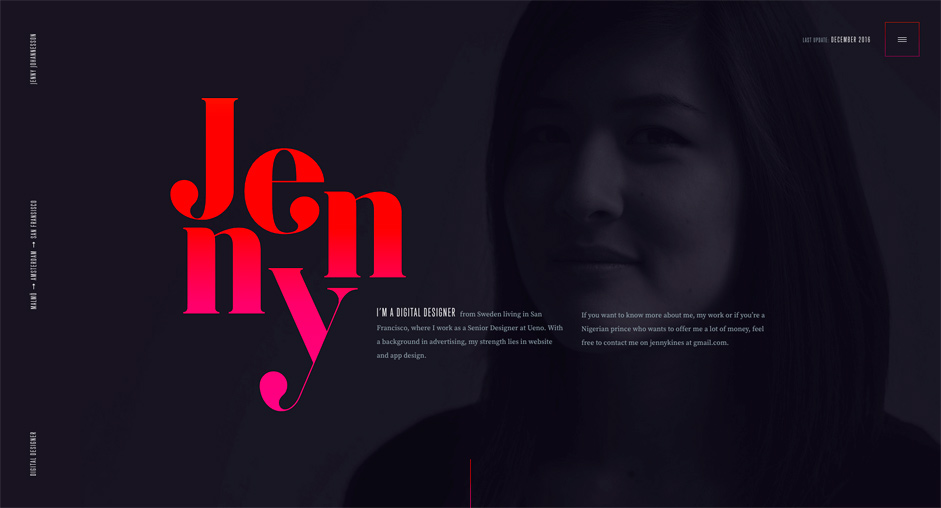
Typography is a part of design too. Make sure you don’t overlook this important design element. Typography is a great way to highlight content. As an example, take a look at a news site. When you look at headings and the side quotes, you can easily see how fonts can garner attention as much as a image.
Hero Images
Speaking of images. Something else that been in trends for the last 3 years, but still makes a huge impression. That’s the Hero Image. What’s a hero image you ask? Simply put, it’s just a big-ol’ image on your home page. For a great example, take a look at Element 502’s home page. Sure it’s a video, but on devices and internet connections that are a little slower, a hero image appears.
Large Content Areas
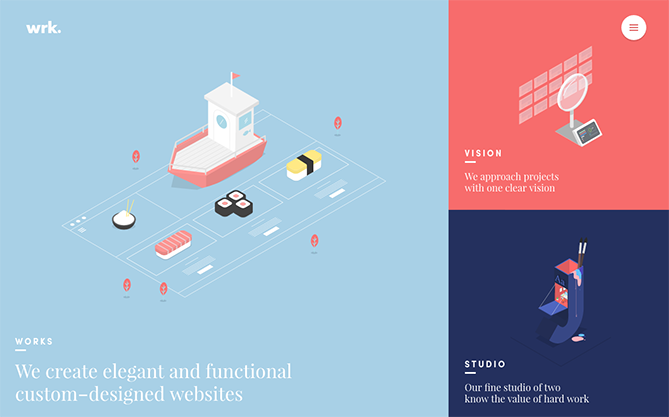
These are areas on your site that let content shine. What’s content you ask? Well my friend, content is the Images, Video, Colors, Fonts on your site. To put it another way, it’s all the pretty things that make people like, and interact with your brand online. What is meant by large content areas? Typically called modular design, it creates vast white space to highlight the content to draw the eye. Take a look below at the example.
Brighter Colors & Bright Gradients
Like comic-based movies, people like brighter colors, so let’s give it to them. Still, be aware. It’s easy to get carried away with color, but if used within the proper boundaries of your brand, it can be awesome. Element 502’s home page has an example of a gradient that is multi-colored but in our brands spectrum.
What trends are you fond of? What trends have you seen that you are glad are gone, or going? Let us know in the comments below, or visit us at Facebook at https://facebook.com/element502 and follow and like us.
I’m personally a huge fan of bright gradients on websites now, providing the colours used work well! A gradient can look fantastic as a row background for CTA’s.
We couldn’t agree more Ryan. Thanks for the comment!
Great article! Totally agree on some of these points! Big fan of using hero images and bright colors and gradients! they really make websites pop and stand out!
Keep up the great posts!
Thanks!
Great stuff is this!! it has all informative things about web designing i have learnt really a good things about web design.. keep it up guys.
Good points and all true. All of the big branded sites are making use of these techniques, and goodness know they are putting a lot of time and money into comparing what designs work best for customer engagement and conversion.
Thanks for sharing.
Truly loved these trends keep sharing these type of posts thank tou for sharing
Excellent!! Your post is very interesting. Thanks for the information you have provided in your blog. This is most important for everyone who want to know about this.
Great information!!! Thanks for sharing this information. Really great…
As a webmaster, I found this article very useful for me
thanks for sharing the article